1
- Mastodon’s userbase milestone;
- I am once again asking you to move to Mastodon.
Continue reading →
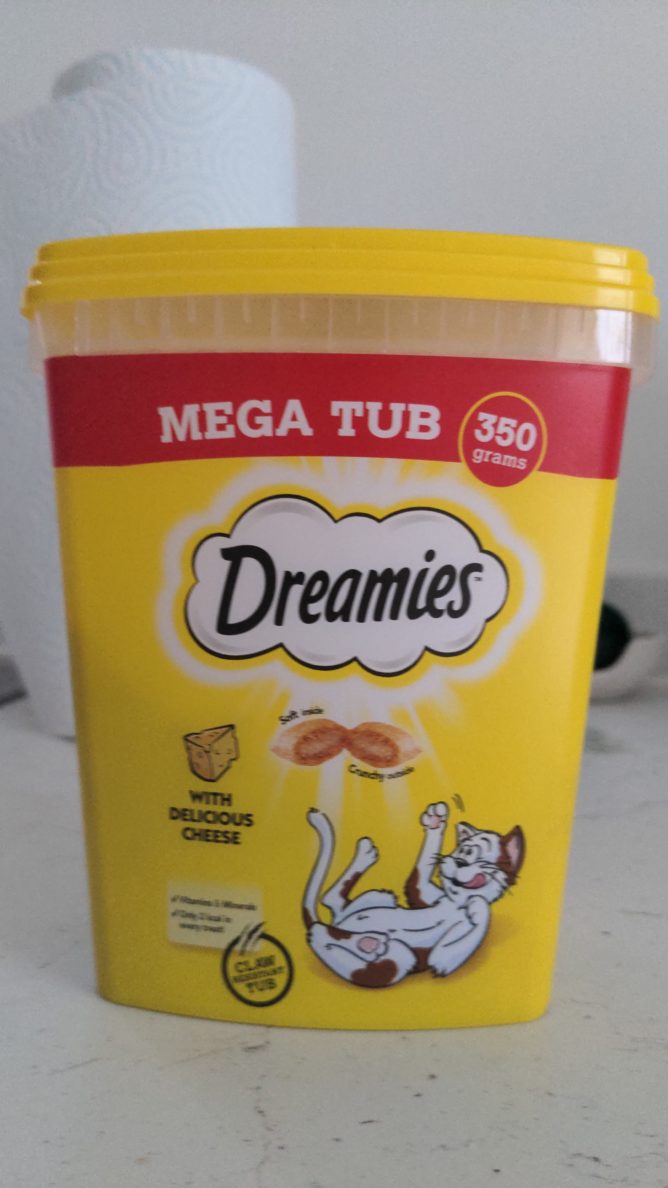
- A strange paradox about a message I read on a tub of Dreamies, and the design of the tub itself.
Continue reading →
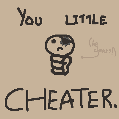
- Tainted Cain is contrived bullshit;
- The Azazel Conundrum: The agony of acknowledging the sheer enormity of one’s wealth, and having to put it to work;
- What is the price to pay for ‘NO DESTINY?’
Continue reading →