- My Dad paints walls for a living. He’s been pretty damn good at it for thirty-five years.
- Using tech to negotiate colours with the customer means you’re working under its limitations
- DON’T PANIC – There are people out there dedicated to studying our visual system’s relationship to what we colloquially call ‘colour…’
My Dad paints walls for a living. He’s been pretty damn good at it for the past thirty-five years.
Actually, he does much, much more than that as a painter and decorator, but suffice it to say that for most of his customers, painting surfaces is the primary service he provides. It’s part of one half of bringing people’s visions into reality, the other half being paperwork.
To not put interior decorating on par with fine art undersells the creative efforts that go into the profession. Dad’s not going out and painting Mona Lisas. He’s too busy painting and decorating the experience of seeing the Mona Lisas of the world. You can’t just host fine art in a dingy hovel – you’ve got to make it look like a place worthy of hosting fine art. It doesn’t need to be fancy – just as long as the paintwork’s even, the cutting in’s seamless, the decor’s modern and rests easy upon the eye, and you have a basic grip on colour theory so everything compliments everything else. Pure teleology – make the place look like it was born to boast its great art from wall to wall. Or, as he might put it, make it look like everything happened for a reason.
Painting and decorating’s full of practical, logistical problems that Dad has to plan for ahead of time, and even then it can often be a dice roll. Do up an exterior one day only for it to piss down biblical the next.2 One pressing technical challenge is communicating with the customer about the colours they want, then mixing the paint so he gets the colours just right. Here’s how that normally plays out: we were getting our hair cut a few weeks ago, and our hairdresser was a customer of Dad’s. At the end of our session, Dad, who obviously had been asked about the job beforehand, wrote for her on a sheet of paper some strange numbers. They looked like this:
#0b7828
#ffa8a8
#8900003
He told her to Google those numbers, or check out this website, and get back to him on what she thinks:
I’ve known for the longest time that these are RGB hex codes. They’re a “””human-readable””” way of encoding and contextualising the 1s and 0s that make up all the possible colours a device with a display can produce – a shorthand for binary numbers. I didn’t think about them beyond, “I know what these are, I learned about this in high school,” until last year. They may appear to be a kind of ID number – a meaningless string of characters only made meaningful because by going to this shelf in that aisle, we can find what we’re looking for. They’re much more than that. Hex codes are a junction at which my profession and Dad’s profession meet – an entrypoint to the digital colour rabbit hole.
My Dad’s customers consult him on colours through the digital world, and he has to mix them in the analogue. Human experience is analogue, it’s jittery, and on the whole a barely lucid mess. The digital experience, at its deepest level, is one of mathematical precision – standards and specifications for just about every little thing that few people have to read, but if they did read up, they’d know they’re trying to describe a world that, when we interact with it, produces an expected result every single time.4 They define the processes by which our inputs produce an output.
I can’t talk about the world of digital colour without bringing up the amazing work of pixel-pusher Troy Sobotka, who has an entire website dedicated to dissecting just what the hell is going on when a customer’s scrubbing sliders up and down looking for the colour they want – and what the hell is going on in our heads when we cognise said colour:
https://hg2dc.com/2019/03/23/question-1/
I’d be lying through my teeth if I said I competently understood even half of the things he talks about. Mainly because I haven’t read every single post on his site in full, but also because I can hear the wheels turning in my head whenever I read, trying to re-evaluate everything I know about ‘colour’ and what ‘colour’ actually is. Were his logo not to bolster the words “DON’T PANIC” in big, friendly bold letters, his wonkery would terrify me. But it does bolster, and so I’m confident in knowing that studying these ideas means I’m engaging in a part of something bigger, and something more important. Like, what’s going on when you slide that little cursor on the colour palette? And what do those hex codes actually mean?
For everything our computers can do, if you strip back the layers of encoding and abstraction, you find out that it’s just 1s and 0s, all the way down. They count in binary numbers (or base 2) because, much like light switches, a gate forming part of a circuit can only ever be on (1) or off (0). In a highly reductionist sense, one that would warrant me a big fat D5 on my CMP101 exam, once you’ve got enough of these circuits connected to each other, you’ve got a rudimentary arithmetic/logic unit and an essential component to the universal architecture of modern computers, as described by John von Neumann in the 1940s.

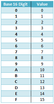
Now, one could write out binary numbers using a base 2 system, that is, only using the 1s and 0s, but hexadecimal – base 16 – has been used from the beginning as a short hand. It’s the first base number system beyond the base 10 (decimal) that we’re used to with a base that’s also a power of two.
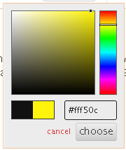
The light-emitting diodes (LEDs) that comprise your device’s display can emit a combination of red, green, and blue light at different intensities. Hex codes are essentially a group of three values that determine the level of intensity for the three colour channels, with 00 (0x00 in hex) representing no intensity (the channel is effectively off), and 255 (0xFF in hex) representing full intensity (The LED is emitting light from the channel at maximum intensity). When you scrub those colour sliders, you are effectively interfacing with your device’s display, telling it to emit light at such and such frequencies). From these three 8-bit channels, there is, theoretically, 224 unique colours our displays can produce.

All of the above is not information that helps Dad at all. At most, it’s technical trivia that will reside in the back of his head, only to spring to mind again if he ever goes on a game show. When trying to discuss colour in terms of hex codes and number-crunching, you’ll always run into this problem. No-one who buys an IKEA bed says, “Ayabastart, knew I shouldn’t have bought that bloody 990.226.87!” You’ve got to kinda vignette it with all this extra guff about computer science, and wink and waggle eyebrows at the end to see if everyone’s on the same page. Human brains do not process information like this. Neither do our visual systems, because we’re not computers in body nor mind. It’s not the artist’s job (nor Dad’s) to explain computer science, and if it was, then they wouldn’t be artists. Dad will be dead in the cold, cold ground before decorators are replaced by side-hustling ‘Well, Actually Number Kids’ (WANKs), who plug their hex codes into their Amazon Mix’n’Roll 3000, the state-of-the-art paint-and-pay-as-you-go automaton of Tomorrow.
Using three colour channels to try and recreate all the colours we see in the natural world is sort of like eating an intricate, complex dish – say, Christmas dinner – and then taking yourself off to a dark room, imagining a Christmas dinner in your mind’s eye, and asking one question: “What’s the bare minimum and essential items required to have something that would constitute a Christmas dinner?” Raw turkey breast, uncooked carrots, unpeeled potatoes, brussel sprouts, and some gravy granules, perhaps? It’s Christmas dinner, but as you’d find it described in an ingredients list.
What we’d colloquially describe as ‘colour’ is a psychophysical phenomenon. For it to exist, there needs to be an observer – us. Our devices are tasked with trying to recreate all the colours we see in the natural world with just three colour channels. As if this task was like an online shop, there will inevitably be substitutes. We swear we see yellow, but it’s really just our screen’s LEDs substituting yellow with an equal, predominant mix of its red and green channels:
Is this yellow ‘fake?’ A lie our visual system tells itself? I don’t think that’s entirely so – that’s like taking my Christmas dinner ingredients list and saying, “Well, actually, it’s not Christmas dinner, it’s really just your garden-variety Sunday roast.” Or taking the turkey away and going, “See, it’s actually just a shit broth.”
https://hg2dc.com/2023/03/18/question-30-what-is-fcking-colour-of-light/
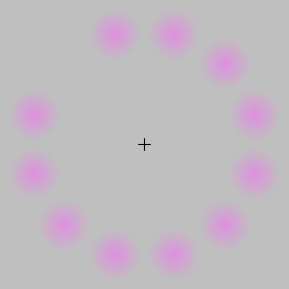
It’s more to do with how our visual system is sensitive to contrast, and the biases in information surrounding our point of focus, as demonstrated in this excellent lecture by neuroscientist Dr. Margaret Livingstone (the whole thing is really worth a watch):
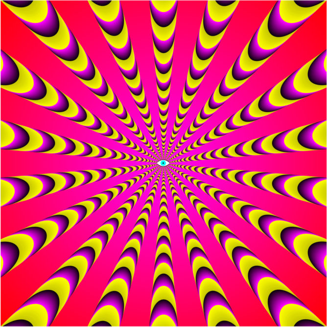
Anyone can pull off an illusion, or a trick of the light – it’s the art of knowing things other people don’t know. I think that to call digital colour’s efforts to emulate the signs of our messy, analogue world an illusion undersells the lengths those efforts, under considerable limitations, go to. It subtracts from our brain’s amazing ability to fill in visual information. Dr. Akiyoshi Kitaoka’s website is no better place to spend hours looking at examples of this. My favourite work of his is this photograph of a strawberry tart:

This brings me back to the ‘fake yellow’ thing. Open up your image editing app of choice, take the eyedropper, and use it on the strawberries. You won’t find any ‘red,’ only an ensemble of grayish colours that look like red.
That’s what’s so interesting. There’s no red in this image, yet our subjective conscious experience can’t help but see that the strawberries are still red. Our visual system fills in this sensory experience of ‘redness’ based on the visual information surrounding it – not because there’s a tiny imp transferring an image to the inside of our eyeballs.
Whether our field of vision is resting on a static image or an animated GIF, it’s constantly reprocessing the information in front of us. As Troy writes:
Our visual cognition is tremendously reliant on the temporal relationship. Some colour might look a given way and, given unique spatio-temporal relationships, shift!
https://hg2dc.com/2023/03/18/question-30-what-is-fcking-colour-of-light/
He gives the example of the Troxler Effect, where unchanging stimuli surrounding our point of focus begin to fade and disappear after a time:
The thought of colours that don’t seem to be there half the time may very well put you in mind of a certain dress that went viral a few years back…9
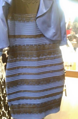
It’s possible for anyone to see that the dress is both white and gold and black and blue. Depending on where I look, my eyes gradually adjust. It can also depend on the viewing conditions of the display – both in the physical world (are the lights on?) and the digital (bright or dark background?)
Digital colour is a map that takes Dad roughly to where he needs to go. If he needs to mix colours for a job – say, pink – he doesn’t worry about the fact that a ‘pure’ digital magenta is his phone’s screen’s LEDs emitting red and green at max intensity with no blue. He sees pink, and tries to reach an approximate. He’ll never truly get that colour he sees on his screen – then again, all the colours his phone could give him are only ever an approximation. Neither will his customers ever give him colours so viscerally vibrant, the kinds that can’t be captured by a digital camera. I’m put in mind of Stuart Semple’s fluorescent pigments – namely, the pinkest pink, and Tom Scott, who gives a brief summary on why it’s impossible for digital video to show you the pinkest pink:
If Dad’s ever had a customer who’s been so persistent in their demands to mix a colour with a likeness down to the hex code, then I’ve never heard the story. Neither have I heard him get a strange phone call from a man calling himself Anish Kapoor10, asking if he can pop round to do a few windows with the pinkest pink, and if he’d be interested in getting some free samples of VantaBlack as payment. Even if I had, what the customer sees is what the customer gets. If that’s the experience surrounding the installations of fine art in a museum, or the contrast of an accent wall, or a Pinterest-worthy kitchen illuminated by smooth, selenic white walls with a satin finish and seamless transitions from corner to corner; if the customer gets all that to an excellent standard of quality, my Dad’s job is done.
- Source: https://www.anopticalillusion.com/wp-content/uploads/2013/08/Eye-Rays-by-Akiyoshi-Kitaoka.jpg, and credit to Dr. Akiyoshi Kitaoka, although I couldn’t find this image on his website… ↩︎
- I think the painter’s job walks the tightrope of being centralised around the ‘clock time’ we’ve all become accustomed to since its rapid adoption during the Industrial Revolution, and the ‘task-oriented time’ of work that has to adapt to the changing seasons. Dad tries to work a set number of hours a day, but whether he’s got work depends on other people and how they schedule their work. Work doesn’t pour in at a constant rate all year round. ↩︎
- Not the actual colours he gave her. ↩︎
- With the exception of networking, where the most immediately available answer for why the internet goes down when everything seems to be functional is to completely reset the router. ↩︎
- Ds get degrees, so the saying goes. Academics settle for ‘satisfactory.’ ↩︎
- https://en.wikipedia.org/wiki/Arithmetic_logic_unit ↩︎
- https://en.wikipedia.org/wiki/Von_Neumann_architecture ↩︎
- http://www.psy.ritsumei.ac.jp/~akitaoka/colorconstancy8e.html ↩︎
- https://web.archive.org/web/20150227014959/http://swiked.tumblr.com/post/112073818575/guys-please-help-me-is-this-dress-white-and ↩︎
- The only person on the planet banned from using Semple’s pigments, because VantaBlack is patented Technology™. Squeeze the small man, the small man squeezes back. ↩︎